Planning a gallery wall around a royal pet portrait
Three ways to group frames around a pet portrait (a grid, a row and a salon cluster), with spacing sums for the four print sizes and lessons from 1787.
By Purrealism. Part of Framing and hanging a royal pet portrait: frames, glass, walls and light.
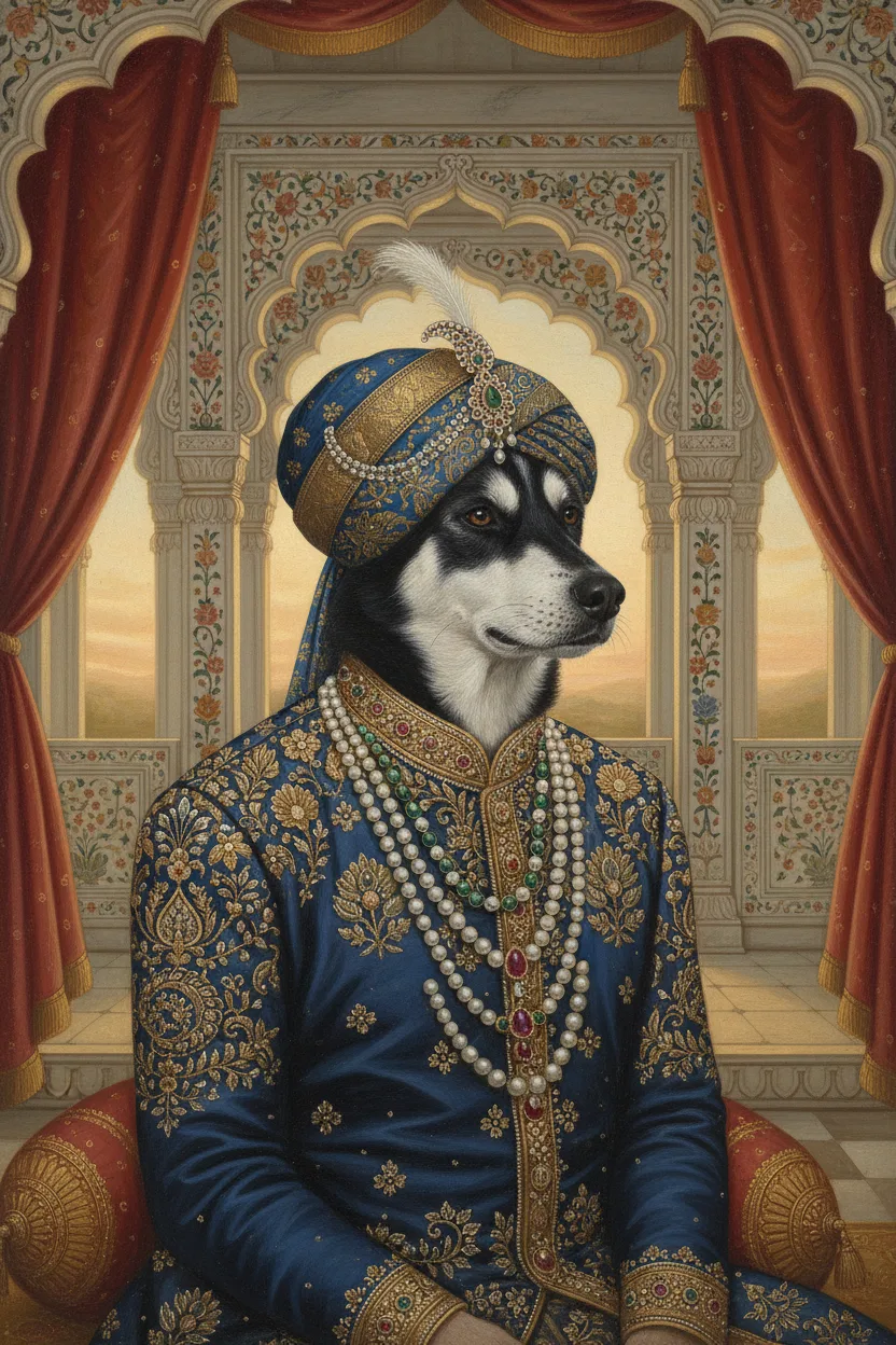
This page is about hanging a royal pet portrait as part of a group: one portrait with other family pictures, a portrait of each pet in the house, or the same pet in two styles. It looks at how the Royal Academy in London crowded its walls in the 18th century, what that history teaches, and three layouts that work in a home. It gives the sums for spacing the four Purrealism print sizes and for choosing a wall colour that lets the portraits stand out. The Purrspectives article on dog wall art ideas explains how to test a group with paper templates on the wall, so this page concentrates on the layout itself. The main framing and hanging guide covers the frames and hardware.
How the Royal Academy filled a wall
The Royal Academy of Arts held its first summer exhibition in 1769, according to the Victoria and Albert Museum. From 1780 its exhibitions took place in the Great Room at Somerset House, designed by the architect William Chambers, as the Government Art Collection records. The Government Art Collection calls the print of the 1787 exhibition, engraved by Pietro Antonio Martini after Johann Heinrich Ramberg, an important record of how the exhibitions were presented in the Great Room.
In the V&A's copy of that print, the frames cover the walls from just above the visitors' heads to the ceiling, with almost no bare wall between them. The Paul Mellon Centre, whose online RA Chronicle traces the Summer Exhibition up to its 250th show in 2018, points out that dogs appear in the scene too: "Frolicking dogs graced the Exhibition of 1787, if J.H. Ramberg's view is to be believed."
The crowding had a reason. The Paul Mellon Centre's history says that by the end of the 18th century the works on display already numbered in the hundreds, that by the end of the 19th century the exhibition held more than 2,000 pieces a year, and that today the figure regularly tops 5,000.
The line, and the pictures above it
The Great Room had a rule for height. The Paul Mellon Centre's glossary explains that Chambers designed a moulding, called the line, that ran around the room at eight feet from the floor. Above it, a wooden framework tilted forward by 17 degrees (the glossary gives both as round figures) to meet the curved top of the wall, so that paintings hung high on the wall still faced the viewer below. Paintings went above or below the line, never across it, and a painting was "on the line" when its frame met the moulding.
Pictures at the top of the wall were called skied. The glossary says there is a long tradition of complaints about where pictures were placed, and that Thomas Gainsborough and John Constable were among the artists whose works were skied.
What to keep from 1787, and what to change
Three ideas from the Great Room still work in a home.
- A shared line. The Academy used one fixed height to organise hundreds of frames. A home group needs the same thing: one line that every frame relates to.
- Tilting high pictures forward. The 17 degree framework shows that a picture high on a wall is seen from below. In a home, keep the group low enough that nothing needs tilting.
- Dogs were part of the scene. The 1787 print shows dogs among the visitors, so a pet portrait on a grand wall has an early companion in that print.
One idea to leave behind is height. No painter wanted to be skied, and a pet portrait near a home ceiling is hard to see. The page on how high to hang a pet portrait gives measured eye heights for standing and seated viewers, which set the middle of the group.
Three layouts for a home
A grid
A grid uses frames of one size, in rows and columns, with equal gaps. It suits several portraits in the same print size: one portrait of each pet, or one pet in four styles. Because each print size has its own shape, a grid of one size keeps every edge in line.
Four 8 × 10 inch prints, each in a frame with a 2 inch border, make four frames of 12 × 14 inches. In two rows of two with 2 inch gaps, the group measures 26 inches wide (12 + 2 + 12) and 30 inches tall (14 + 2 + 14). With its middle at 57 inches, the group runs from 42 to 72 inches above the floor.
A row on one centre line
A row puts frames side by side with their middles at one height. It suits a mix of sizes, with the largest portrait in the middle.
Take an 18 × 24 inch portrait in the middle and a 12 × 16 inch portrait on each side, all with a 2 inch border. The frames measure 16 × 20, 22 × 28 and 16 × 20 inches. With 3 inch gaps, the row is 16 + 3 + 22 + 3 + 16 = 60 inches wide. With a shared centre at 57 inches, the middle frame runs from 43 to 71 inches and the side frames from 47 to 67 inches. Above an 84 inch sofa, the row covers 71 percent of the sofa's width.
You can instead line the three frames up along their top edges at 71 inches. The small frames then drop to 51 to 71 inches, and the bottom edges step down from the sides to the middle. Each gives a different look. A centre line looks calm and symmetrical; a top line looks tidy from across the room.
A salon cluster
A salon cluster is a loose group of mixed sizes arranged around one main picture, in the spirit of the 1787 walls but lower. Put the largest portrait off centre and build smaller frames around it with equal gaps. Keep the outer edge of the whole group close to a rectangle, so it looks like one shape on the wall.
Work out the cluster's outside size the same way: add the widths across the widest row and the heights down the tallest column, gaps included. Then place the middle of that rectangle at your chosen centre height.
Spacing: a sum you can check
Whatever the layout, the width of a group is the sum of the frame widths plus every gap. The height is the sum of the frame heights in a column plus the gaps between them. Keep the gaps equal across the group. Equal gaps make a mixed group look planned, and they make the sums easy.
Measure each frame's outside size after framing, mat included. The page on how to measure a frame gives the outside sizes for each print size with and without a mat.
A wall colour that lets the portraits stand out
The Smithsonian's guidelines for accessible exhibition design say objects in front of a solid, contrasting background are most easily perceived, and they recommend a 70% contrast between an object and its background. They also warn that objects placed against busy backgrounds are hard to see for people with low vision.
The guidelines give a formula. Contrast equals the light reflectance value of the lighter area, minus that of the darker area, divided by the lighter value, times 100. Light reflectance value measures how much light a surface reflects. For example, a wall with a value of 80 behind a portrait area with a value of 20 gives (80 − 20) ÷ 80 × 100 = 75%, which passes. A mid-tone wall behind a mid-tone portrait will not.
In practice, choose a plain wall whose value differs from the portrait's main colours by enough to reach 70%. A gallery wall on patterned wallpaper makes each frame harder to pick out.
Mixing styles, pets and frames
Purrealism offers 15 portrait styles: nine from Indian courts (Indian Royalty, Maharaja, Maharani, Patiala Royalty, Chola Warrior, Mysore Royal, Mughal Emperor, Rajput Warrior and Maratha King) and six from European periods (Renaissance Royal, Victorian Noble, Military General, Medieval Knight, Baroque Aristocrat and Regency Era). A group can mix them. What ties a mixed group together is a shared element: one frame colour, one mat colour, or one shared line.
For a two-pet household, the gallery shows how different styles look side by side. Both the Maharaja golden retriever and the Maharani cat include gold, so one gold frame colour suits both. The page on choosing a frame for a royal pet portrait matches frame colours to each gallery portrait.
Hardware and places to avoid
A group means many holes. The Canadian Conservation Institute describes picture rail systems, a metal track fixed high on the wall from which frames hang on wire or chain, and says they remove the need to make and patch holes each time a picture changes. A rail suits a group you expect to grow. The page on picture hanging hardware covers hooks and anchors for each wall type.
The Institute also advises against hanging paintings where people might brush against them, naming narrow corridors and stairwells, and where they might touch furniture, doors or curtains. On a stair, frames sit close to the shoulders and bags of people walking up and down. Choose a wide stair, or a wall in a room people walk past instead of through.
Questions and answers
What is a salon-style hang?
A salon-style hang is a wall covered with many frames hung close together, from near eye level up toward the ceiling. One record of it is the 1787 print of the Royal Academy exhibition at Somerset House, which the Government Art Collection calls an important record of how the exhibitions were presented. In the V&A's copy, frames cover the walls edge to edge.
What does on the line mean for a painting?
A painting hung on the line had its frame meeting a moulding that ran around the Royal Academy's Great Room at Somerset House. The Paul Mellon Centre's glossary says architect William Chambers designed this moulding at eight feet from the floor, the glossary's round figure. Paintings were placed above or below the line, never across it.
What does it mean when a painting is skied?
A skied painting is one hung at the top of a gallery wall, far from the visitors' eyes. The Paul Mellon Centre's glossary of the Royal Academy Summer Exhibition says there is a long tradition of complaints about how pictures were placed, and names Thomas Gainsborough and John Constable among the artists whose works were skied.
Why were paintings tilted forward at the Royal Academy?
Paintings at the Royal Academy's Great Room were tilted forward so that high pictures still faced the people below. The Paul Mellon Centre's glossary says a wooden framework rose from the moulding called the line, tilted forward by 17 degrees, a round figure, to meet the curved top of the wall, and paintings hung on it squarely faced the viewer.
How many works were shown at the Royal Academy Summer Exhibition?
The Royal Academy Summer Exhibition showed hundreds of works by the end of the 18th century. The Paul Mellon Centre's history of the exhibition says it held more than 2,000 pieces a year by the end of the 19th century, and that the figure today regularly tops 5,000. That crowding explains why pictures once covered the walls up to the ceiling.
How do you work out the width of a row of framed portraits?
The width of a row of framed portraits is the sum of all the frame widths plus every gap between them. Three frames 16, 22 and 16 inches wide with two 3 inch gaps make a row 60 inches wide. Measure the outside size of each finished frame, including the mat and moulding, before you add them up.
Should frames in a group line up at the top or the centre?
Frames in a group can line up at the top or through the centre, and each gives a different look. A shared centre line keeps frames of different sizes level through the middle, so a large portrait sits between smaller ones like the centre of a balance. A shared top edge gives a straight line across the top and lets the bottom edges step down.
What wall colour makes a framed portrait easier to see?
A plain wall that contrasts with the portrait makes it easier to see. The Smithsonian's guidelines for accessible exhibition design say objects in front of a solid, contrasting background are most easily perceived, and recommend 70% contrast between an object and its background. They warn that busy, patterned backgrounds are hard to read for people with low vision.
Can you mix Indian and European portrait styles on one wall?
Indian and European portrait styles can hang on one wall. Purrealism offers 15 styles, nine from Indian courts, such as Maharaja and Mughal Emperor, and six from European periods, such as Renaissance Royal and Regency Era. Frames in one colour or one wood tone make a mixed group look like a set, and a shared centre line keeps the different sizes level.
Is a staircase a good place for a gallery wall?
A staircase is a risky place for a gallery wall. The Canadian Conservation Institute advises against hanging paintings where passers-by might brush against or touch them, and names narrow corridors and stairwells as examples. On a stair, frames are easily knocked by shoulders, bags and hands, so choose a wide stair or use thin frames hung above shoulder height.
Sources
- Glossary, Paul Mellon Centre for Studies in British Art. Accessed September 28, 2026.
- Art Made Now: Chronicling the Summer Exhibition, Paul Mellon Centre for Studies in British Art. Accessed September 28, 2026.
- 1787: Contemporary History Painting, Paul Mellon Centre for Studies in British Art. Accessed September 28, 2026.
- The Exhibition of the Royal Academy, 1787, Victoria and Albert Museum. Accessed September 28, 2026.
- The Exhibition of the Royal Academy, 1787, Government Art Collection. Accessed September 28, 2026.
- Smithsonian Guidelines for Accessible Exhibition Design, Smithsonian Accessibility Program. Accessed September 28, 2026.
- Storage and Display Guidelines for Paintings, Canadian Conservation Institute. Accessed September 28, 2026.
Short reads on this topic
Articles from Purrspectives that answer one question each.
Cat wall art ideas: choosing a cat portrait for every room
Cat wall art for each room: the print size for a hall, living room, bedroom or small flat, the cat portrait that suits its colours, and where to keep it safe.

Dog wall art ideas: how to choose and hang a portrait of your dog
Good dog wall art fits its wall: pick a print size for the furniture below, hang it with its centre at eye level, and keep it out of direct sun.

How big is an 8 × 10 print? Pet portrait print sizes explained
An 8 × 10 print is 20.32 × 25.4 cm, with a 4:5 shape. See all four portrait print sizes in cm, plus the pixels, frames and mats each one needs.