Lightfastness: how fading is measured and why prints fade
Lightfastness is how well a colour resists fading in light. Learn the Blue Wool scale, the ASTM test for artists' colours, and why inkjet prints can fade.
By Purrealism. Part of Art prints and paper: how a portrait print is made, sized and kept.
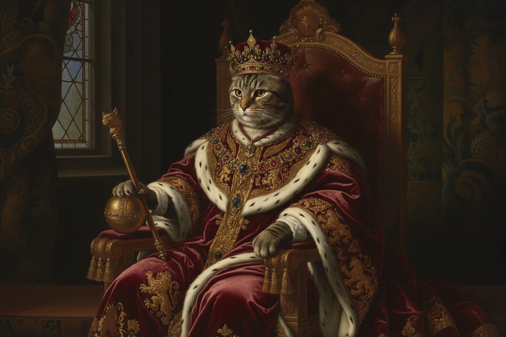
Lightfastness describes how well a colour resists fading when light falls on it. A print with lightfast inks keeps its colours longer on the wall. This page explains how fading adds up, how scientists measure and rate lightfastness with the Blue Wool scale and the ASTM test for artists' colours, why the colours of a print can change unevenly as they fade, and how a gas in ordinary indoor air can fade some inkjet prints in the dark. It is part of the guide to art prints and paper. Where to hang a print and how to light it belong to the guide on framing and hanging.
Light damage adds up
The Canadian Conservation Institute, part of the Government of Canada, explains fading with one idea: the total dose. The dose of light on a surface is the light level multiplied by the time. Light level is measured in lux, and time in hours, so museums count the dose in millions of lux hours, written Mlx h.
This means a dim light for a long time can do the same damage as a bright light for a short time. A print under 50 lux for 20,000 hours receives one million lux hours. So does a print under 100 lux for 10,000 hours.
The Institute also says light damage cannot be undone. In its words, there is no true recovery possible from faded colours or disintegrated surfaces. Every hour of light adds to the total.
It separates three kinds of radiation. Light is the band our eyes can see. Ultraviolet and infrared are invisible. The Institute says ultraviolet and infrared are not needed for seeing, so they add damage without adding anything to the view.
The Blue Wool scale
To compare how fast different materials fade, industry uses a set of reference cloths called the ISO Blue Wool standards. The Canadian Conservation Institute says the original eight Blue Wools were developed in the 1920s. They covered the range of sensitivity that the dye and colour industry knew from the coloured goods of the time.
Each Blue Wool is 2 to 3 times as sensitive to light as the next one up the scale. Wool 1 fades first and wool 8 last. More wools were later added above 8 as industry needed them.
The Institute groups the ratings into three bands:
| Sensitivity | Blue Wool rating | Examples the Institute lists |
|---|---|---|
| High | 1, 2 or 3 | Most plant dyes, most felt tip pens, most colour photographs with "colour" in the product name |
| Medium | 4, 5 or 6 | Alizarin dyes, most colour photographs with "chrome" in the product name |
| Low | 7, 8 or higher | Artists' palettes classed as permanent, such as ASTM D4303 Category I |
How long before a fade shows
The Institute turns these bands into time. It uses a "just noticeable fade", the smallest change that users of a product would call noticeable, and a nearly total fade. The table below gives its figures for a just noticeable fade at two light levels.
| Sensitivity | At 50 lux | At 150 lux |
|---|---|---|
| High | 1.5 to 20 years | Half a year to 7 years |
| Medium | 20 to 700 years | 7 to 200 years |
| Low | 300 to 7,000 years | 100 to 2,000 years |
Tripling the light level from 50 to 150 lux cuts each time to one third, allowing for the Institute's rounding. That matches the idea of a total dose.
Materials that do not fade in light
The Institute's table has a fourth column for materials that do not change colour in light, although they may still change with age or pollution. It lists most mineral pigments, the colours of glass enamels and ceramics, and carbon inks. It adds two warnings that matter for prints. The tint of the paper, and any tint added to a carbon ink, are often highly sensitive. Paper itself should be treated with caution as low sensitivity. The same table places most dyes used to tint paper in the 20th century in the high sensitivity group. So the white or cream of the sheet under a portrait can change too, even when the inks hold.
The table also gives times for an almost total fade. At 50 lux, a highly sensitive colour reaches it in 50 to 600 years, a medium one in 700 to 20,000 years, and a low one in 10,000 to 200,000 years.
The ASTM test for artists' colours
ASTM International, a standards organisation, publishes D4303, the standard test methods for the lightfastness of colorants used in artists' materials. Its summary describes four methods:
- Method A: exposure to natural daylight through window glass in southern Florida.
- Method B: exposure to natural daylight through window glass in Arizona.
- Method C: exposure in a xenon-arc lamp device, without humidity control, that copies daylight through window glass.
- Method D: the same lamp exposure with humidity control.
To place a colour in a category, the standard uses one of the daylight methods and one of the lamp methods. It measures the colour of each sample before and after, and calculates the difference with the CIE 1976 Lab* equation, a formula from the International Commission on Illumination that turns a colour change into a number.
The standard is honest about its limits. Its summary says the colour changes from fast testing may not match what happens indoors in a home, gallery or museum, but the relative resistance of colours to change can be established. So a category tells you how one colour compares with another. The standard also says it covers only lightfastness, and not other things that affect how long art materials last.
Why colours change unevenly
A print is made from several inks, and each one fades at its own rate. The Image Permanence Institute at Rochester Institute of Technology defines colour shift as a change in the colour of a print caused by unequal fading of the individual colorants, or by yellowing of the paper. If one ink fades before the others, the whole picture shifts toward the colours that remain.
For a royal portrait, the areas at risk are those built from mixed inks, such as a red robe, a gold throne or the brown of a dog's coat.
Fading without light: ozone
Light is one cause of fading. Air is another. Ozone is a reactive gas found in small amounts in indoor air. The Image Permanence Institute tested its effect on digital prints, and a report on the work was published by the American Institute for Conservation.
The researchers exposed prints to ozone in a closed chamber for two weeks. They calculated that the dose equalled 21 years of ozone at the expected indoor level of 9 parts per billion, if ozone damage depends only on the total dose. They found that:
- dye inkjet prints on porous-coated paper could be almost completely bleached,
- the ink-receiving coating of some photo papers cracked and flaked,
- dye and pigment inkjet prints were both more sensitive to ozone than laser, dye sublimation or traditional prints,
- prints held up better on plain document paper than on photo paper.
Porous-coated papers take in ink through tiny open spaces. The page on matte and glossy paper explains how these coatings differ, and the page on storing unframed prints covers sleeves that limit contact with air.
Where inkjet inks fit
None of the sources on this page gives a single Blue Wool rating for inkjet prints. The Image Permanence Institute says the sensitivity of digital prints varies from product to product, so two prints on similar paper from different printers can age at different speeds.
The general direction is clear. The University of Illinois Library's preservation guide says pigment inks are more lightfast than dye inks, and that pigment prints on good paper may last more than 100 years before any fading occurs. The same guide says all inkjet prints should be protected from light and humidity, and that even neutral black and white inkjet prints can fade and turn yellowish brown. The page on archival paper and inks explains how paper and ink choices work together.
What this means for a royal pet portrait
Purrealism offers each portrait as a digital download or as an art print in four sizes, on matte or glossy paper, chosen in the portrait studio. If you print a download yourself, ask the print shop whether it uses pigment or dye inks, and whether the ink maker states a lightfastness rating or test method. A named test gives you something to compare.
Faded colours cannot be restored, so keep the original file of the portrait: a new print can always be made from it. Portraits in the gallery, such as the golden retriever Maharaja in a red jewelled turban on a gold throne, are built from many mixed colours. Keeping a print away from strong light and polluted air keeps that balance for longer.
Questions and answers
What is lightfastness?
Lightfastness is how well a colour keeps its appearance when it is exposed to light. ASTM International's standard D4303 tests it for artists' colours by exposing samples to daylight through window glass, or to a lamp that copies it, and measuring the colour change. The Canadian Conservation Institute groups coloured materials into high, medium and low sensitivity to light.
How is lightfastness measured?
Lightfastness is measured by exposing a colour to strong light for a set dose and comparing its colour before and after. ASTM D4303 describes four methods: daylight through window glass in southern Florida or in Arizona, and two xenon-arc lamp methods that copy that daylight. The colour change is calculated with the CIE 1976 L*a*b* colour difference equation.
What does lightfastness 1 mean?
Lightfastness I refers to Category I in ASTM D4303, the standard lightfastness test for artists' colours from ASTM International. The Canadian Conservation Institute lists artists' palettes classed as permanent, such as ASTM D4303 Category I, among materials with low sensitivity to light, rated ISO Blue Wool 7, 8 or higher. At 50 lux, such materials take 300 to 7,000 years to show a just noticeable fade.
What is the Blue Wool scale?
The Blue Wool scale is a set of wool cloths dyed blue, used as references for how fast a material fades in light. The Canadian Conservation Institute says the original eight Blue Wools were developed in the 1920s, and that each is 2 to 3 times as sensitive as the next. Wools 1 to 3 mark high sensitivity and 7 or higher mark low sensitivity.
What is a just noticeable fade?
A just noticeable fade is the smallest colour change that people would notice in practical use. The Canadian Conservation Institute says the term comes from industry, where it marks the change that users consider just noticeable. It uses the term to show risk: a highly sensitive colour under 50 lux of light reaches a just noticeable fade in 1.5 to 20 years.
What does a million lux hours mean?
A million lux hours is a unit for the total dose of light that falls on a surface, written Mlx h. The Canadian Conservation Institute explains that the dose is light intensity in lux multiplied by time in hours. So 50 lux for 20,000 hours and 100 lux for 10,000 hours both give one million lux hours, and cause the same fading.
Why do some colours in a print fade before others?
Some colours in a print fade before others because each ink or dye has its own sensitivity to light and air. The Image Permanence Institute calls the result colour shift: a change in the colour of a print caused by unequal fading of the individual colorants, or by yellowing of the paper. A portrait can then change toward one colour as another fades.
Can ozone fade an inkjet print?
Ozone can fade an inkjet print. In Image Permanence Institute tests reported by the American Institute for Conservation, dye inkjet prints on porous-coated paper could be almost completely bleached, and some photo paper coatings cracked and flaked. The test dose equalled 21 years of normal indoor ozone. Dye and pigment inkjet were both more sensitive to ozone than laser or dye sublimation prints.
Can faded colours in a print be restored?
Faded colours in a print cannot be brought back. The Canadian Conservation Institute says there is no true recovery possible from faded colours or disintegrated surfaces, and that light damage adds up over the whole life of an object. For a printed portrait, the practical remedy is a new print from the original file, so keep that file safe.
Does photo paper fade?
Photo paper and the images on it can fade over time. The Canadian Conservation Institute rates most colour photographs with colour in the product name, such as Kodacolour or Fujicolour, as highly sensitive to light. The University of Illinois Library says inkjet prints should be protected from light and humidity, and that even neutral black and white inkjet prints can fade to yellowish brown.
Sources
- Agent of deterioration: light, ultraviolet and infrared, Canadian Conservation Institute, Government of Canada. Accessed September 28, 2026.
- D4303 Standard Test Methods for Lightfastness of Colorants Used in Artists' Materials, ASTM International. Accessed September 28, 2026.
- IPI's Guide to Preservation of Digitally-Printed Images, Image Permanence Institute, Rochester Institute of Technology. Accessed September 28, 2026.
- Lessons in Digital Print Preservation: The DP3 Project, American Institute for Conservation, Topics in Photographic Preservation, Volume 14. Accessed September 28, 2026.
- ICC Frequently asked questions, International Color Consortium. Accessed September 28, 2026.
- Digital Prints, Preservation Self-Assessment Program, University of Illinois Library. Accessed September 28, 2026.
Short reads on this topic
Articles from Purrspectives that answer one question each.
Cat wall art ideas: choosing a cat portrait for every room
Cat wall art for each room: the print size for a hall, living room, bedroom or small flat, the cat portrait that suits its colours, and where to keep it safe.
Dog wall art ideas: how to choose and hang a portrait of your dog
Good dog wall art fits its wall: pick a print size for the furniture below, hang it with its centre at eye level, and keep it out of direct sun.
How big is an 8 × 10 print? Pet portrait print sizes explained
An 8 × 10 print is 20.32 × 25.4 cm, with a 4:5 shape. See all four portrait print sizes in cm, plus the pixels, frames and mats each one needs.